
EXPO:
SOUTH KOREA
South Korea's Pavilion for the 2025 World Expo
Korea’s pavilion aims to encapsulate the theme of 'connecting lives' at the 2025 Expo by framing it through the unique lens of Korean society's upbringing. It uses cultural elements as a unifying thread to illustrate the concept of “We”, emphasizing the collective 'we' over the individual 'I.' The goal is to explore Korea's collectivist nature and its influence on the nation, encouraging visitors to collaborate and work together, ultimately leaving feeling inspired by Korean culture.
Timeline
6 Weeks
(Fall 2023)
Programs
Adobe PS/Ai/AE
Arduino/IoT
Rhino
Unity
Roles
Content Strategist
Creative Direction
Creative Technologist
Graphic Designer
Spatial Designer
UI/UX Designer
Skills
3D Modeling
Experience Design
Interaction Design
Lo-Fi Prototyping
Physical Prototyping
Projection Mapping
Storyboarding
Research
South Korea's History
My research was largely condensed into three time periods of the past, present, and future. I was especially drawn to Korea’s unique story of economic growth that led to its rapid development, known as the “miracle on the Han river”.


The Concept
We, Not I
The Korean word for our, “woori”, is used to describe and reference a person or community to which a person belongs. For example, when referencing the nation, people will say “woori nara” (our country). This concept is used for the pavilion as an opportunity to learn about Korea’s collectivist nature and how it influences Korea as a nation

User Journey
Mapping the User Experience
The pavilion follows a linear path, diving into the past, present, and future of Korea. Through all steps of the journey, visitors directly engage with Korean culture. While highlighting the main themes and goals of the Expo, the pavilion ultimately seeks to excite visitors about Korea as a country.


Spatial Design
Spatial Intervention
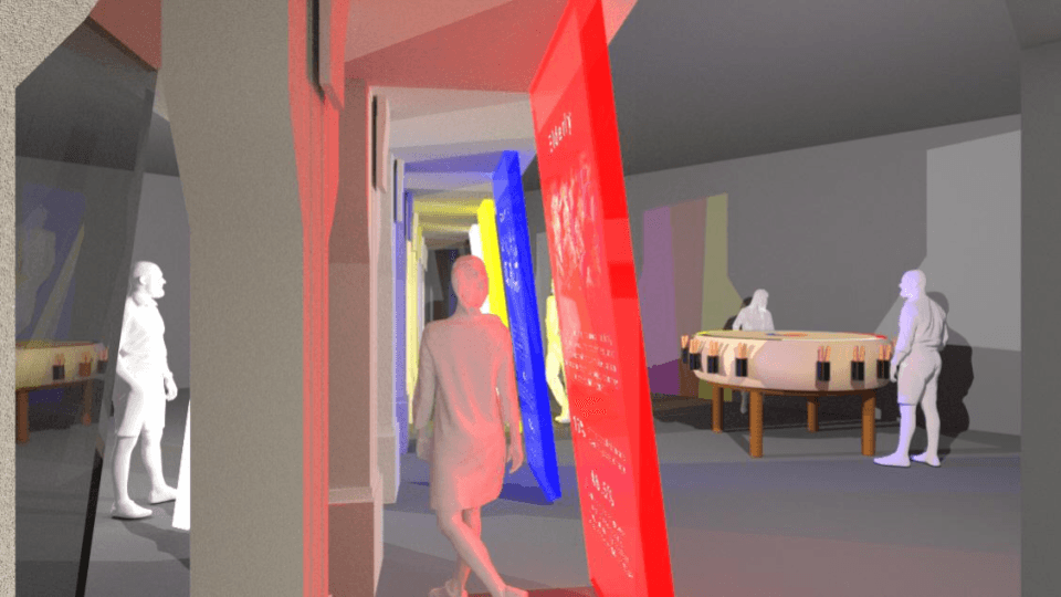
I chose to fully design the future space, in which I envisioned a three-layered interaction guided by the physical bridge. Upon entering, visitors first passively engage with the interior and exterior projections of the bridge before moving to the outer areas where the drums are located.


User Journey
Touchpoints

1. Passive Projection
The first layer is a passive experience where visitors walk across the bridge, exploring projections that describe various Korean communities. It introduces the connection between communities, their colors, and the challenges they face, with colors drawn from the traditional Korean color scheme.

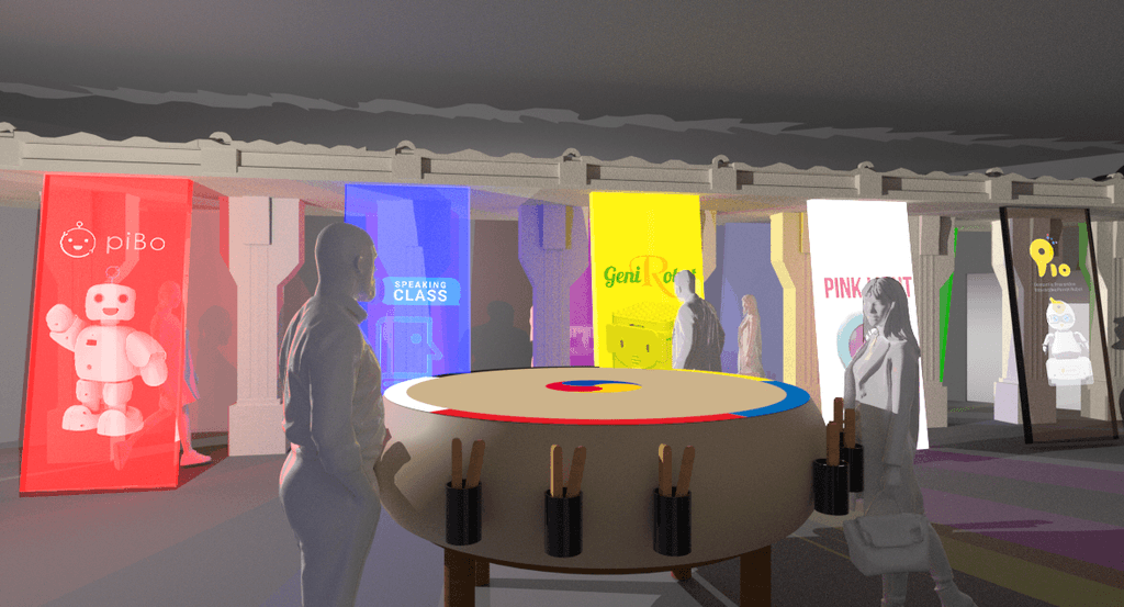
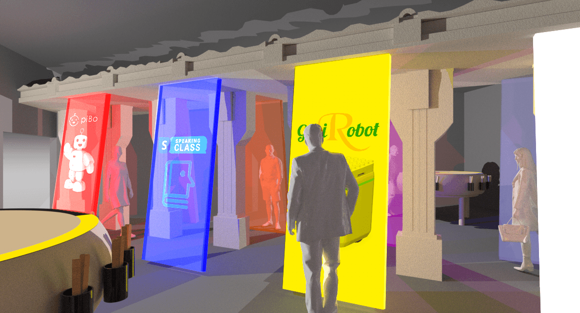
2. Active Projection
The second layer is an active experience where users control outer projections with the drum. Each drum hit triggers different sounds and content, with projections displaying technology descriptions. Each corner represents a community color. Users drum to reach a threshold, lighting up the center symbol, prompting them to strike it. Hitting the center cycles through content and randomly selects a new technology projection based on the color hit.

3. Group Interaction
Returning to the pavilion's theme, how can visitors be encouraged to collaborate toward a common goal? Users can work together to reach the threshold for one color more quickly, or hit two different colors to reach their thresholds and change the projections for each color.
Branding
Imagery
I utilized the imagery and motif of the Han River bridge, which is directly related to the story of the “miracle on the han river”, in order to connect the past to the future. Pictured below, the Banpo Bridge features a water fountain and light show that matches audio to the physical environment.

Branding
Visual Content
I developed simple graphics for the projections, which will be overlayed on the water's surface. To enhance visibility, the design was kept minimal, focusing on educational content.


Creative Technology
Physical Prototyping

I created a physical prototype for the traditional drum, utilizing 3D printing and cardboard to create the drum and drumsticks. Utilizing Arduino and IoT technology, force sensors are located at each corner of the drum and the middle, which inputs if contact is made with the area. This data is sent to the drumsticks, which light up in response to the location and amount that the drum has been hit.


Creative Technology
Systems Diagram

Final Thoughts
Reflection & Takeaways
Through this project, I learned how to effectively balance multiple design elements and user interactions within a single experience. One key takeaway was the importance of understanding the needs and preferences of diverse users, allowing me to create both passive and active layers that cater to different interaction styles. I also gained valuable experience in prototyping and iteration, learning how to test, refine, and adapt both visual assets and physical components to create a cohesive experience.
Additionally, I learned how to manage the complexities of designing an immersive, multi-layered experience while maintaining accessibility and educational depth. This project pushed me to think more critically about how different elements of design—visual, physical, and interactive—come together to form a unified narrative. It also taught me how to troubleshoot and problem-solve on the fly, ensuring that each touchpoint in the experience functioned smoothly while remaining true to the overall vision.


