
ECO WARRIORS
A food sustainability intervention at the East End Food Co-Op
A spatial intervention designed at East End Food Co-Op, a community-based grocery store in PGH. The experience seeks to help customers build sustainable habits through actionable nudges, fostering informed choices during shopping. The scale is reimagined as an entry point to an informational and educational experience in which users can learn about different aspects of the product they pick up as they shop.
Timeline
5 Weeks
(Spring 2024)
Programs
Adobe PS/Ai/AE
Arduino
Figma
p5.js
Rhino
Team
Carissa Chou:
Animator
Motion Designer
UI/UX Designer
Visual Designer
Sojung Pak:
Content Strategist
Creative Technologist
Motion Designer
Video Editer
Skills
3D Modeling
Brand Design
Coding
Experience Design
Interaction Design
Lo-Fi Prototyping
Motion Graphics
Physical Prototyping
Storyboarding
Research
Site Visit & User Interviews


Research
Defining the Problem Space
How might we encourage shoppers to build sustainable habits on an individual level?
We started with the goal of addressing food waste and, through research into existing solutions and psychology studies, narrowed our focus to grocery stores. Identifying grocery shoppers as our target audience, we explored local Pittsburgh grocery stores and organizations already working on this issue. The East End Food Co-Op emerged as an ideal opportunity to expand our impact at a community level, as it is collectively owned by its members. Recognizing that many individuals struggle to identify sustainable options, we aimed to drive behavioral change by intervening at the most micro level—helping shoppers make more informed, conscious decisions at the point of purchase.
Research
Key Insights
We conducted on-site research at the East End Food Co-Op by conducting interviews with various users. We specifically sought insight from both workers and customers to learn more about why people shopped specifically at the Co-Op and what kind of information and experience they wanted.


Defining Objectives
Establishing our Goals
Building on our research findings, we translated challenges in the current problem space into actionable design objectives. Our goal was to create an intervention that not only raises awareness about food waste but also empowers grocery shoppers to make more sustainable choices effortlessly. By focusing on behavioral nudges and clear communication strategies, we aimed to bridge the gap between intention and action.
User Journey
Mapping the User Experience

User Journey
Touchpoints
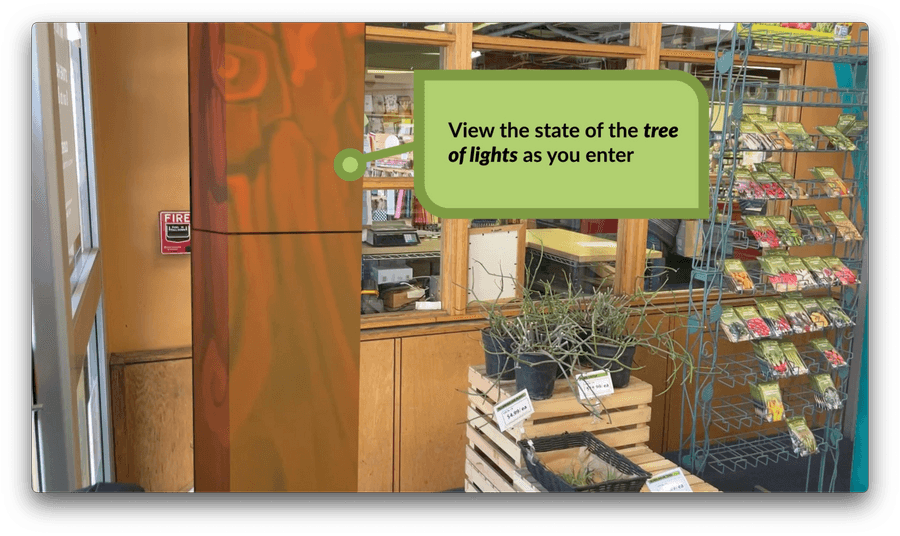
1. Tree of Lights
The Tree of Lights is a physical installation positioned at the entrance and exit of the store. Serving as both a symbolic and interactive element, the tree’s lights illuminate to reflect individual contributions to the sustainability initiative while also showcasing the collective progress of the community.

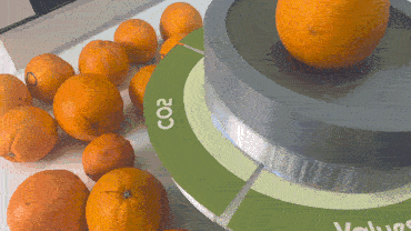
Sustainability Scale
The scale serves as an entry point to an interactive and educational experience, allowing users to learn about various aspects of the products they pick up. This interaction empowers shoppers to make more informed and conscious purchasing decisions.

Shopping Cart Handle
As customers add items to their cart, the handle dynamically displays the real-time average emissions saved from their selections. This touchpoint encourages mindfulness throughout the shopping experience, reinforcing sustainable purchasing decisions.
Branding
Existing Branding
Inspired by the existing branding of the East End Food Co-Op, we aimed to preserve the playful characterization of the illustratinos while introducing a more structured color palette. Drawing inspiration from children's books, we eventually merged this idea with superhero themes, leading to the creation of our final hero character and the branding of the project as “Eco Warriors.”


Branding
Visual UI
Building on the existing characters, we created Oscar, the orange sustainability captain. His quirky, endearing design maintains the playful tone of the experience, making sustainability feel approachable and empowering in a fun way.


User Testing
Refining Scale Interactions and UI
As we developed the scale interaction and UI, we focused on creating features that felt seamless yet engaging. Through multiple iterations, we refined the content, layout, and physical interaction with the scale to enhance the user experience. The main feedback we received centered on prioritizing information for quick, digestible content delivery.

Creative Technology
Physical Prototyping

One of the challenges we identified was lowering the barrier to learning. If the effort required to access information was higher than simply Googling it, customers would be less likely to engage with our product. To address this, we designed a projection that appears below the price at the fruit stalls. As soon as customers use the scale, relevant learning information appears directly on the scale, eliminating the need for a phone and seamlessly integrating into existing shopping habits.
We created the physical prototype of the scale using 3D printing and Arduino. Force sensors placed at each corner and the center of the scale detect contact, sending data to the computer, which triggers lighting responses. Users can interact with the screen to select the category of information they want to learn more about.


1. Introduction
Placing the product on the scale triggers the display. The character encourages you to learn more by tapping on a part of the wheel.

Selection
The load bar will fill up when holding down in an area. The category will be selected once the load bar is complete.


Information
An animation will play depicting the chosen information. Once viewed, users can select another category to view.
Final Thoughts
Reflection & Takeaways
Through this project, we learned that integrating sustainability into everyday shopping experiences requires a balanced combination of accessibility, engagement, and education. By creating an intuitive, seamless system that combines both physical and digital elements, we were able to empower users to make more sustainable choices without disrupting their usual habits. Key takeaways include:
Accessibility is Key – Lowering barriers to learning ensures users can easily access information without frustration. Often, the challenge is simply a lack of knowledge or the opportunity to engage with relevant material.
Seamlessness Enhances Engagement – Integrating interactive features into familiar shopping behaviors creates a more natural, engaging experience. When introducing new technology into an existing workflow, ensuring smooth integration reduces discomfort and encourages adoption.
Iterative Design Drives Improvement – Multiple iterations helped refine our approach, especially in content presentation and interaction design, ensuring the product was both effective and user-friendly. Testing the design on people unfamiliar with the EEFC or our project provided valuable feedback that helped us refine and redirect our design.


